COMUNICATION · UX/UI DESIGNER
Vodafone VAT
Redesign of Vodafone’s VAT dashboard.
PROJECT
06
MY ROLE
UX/UI Designer

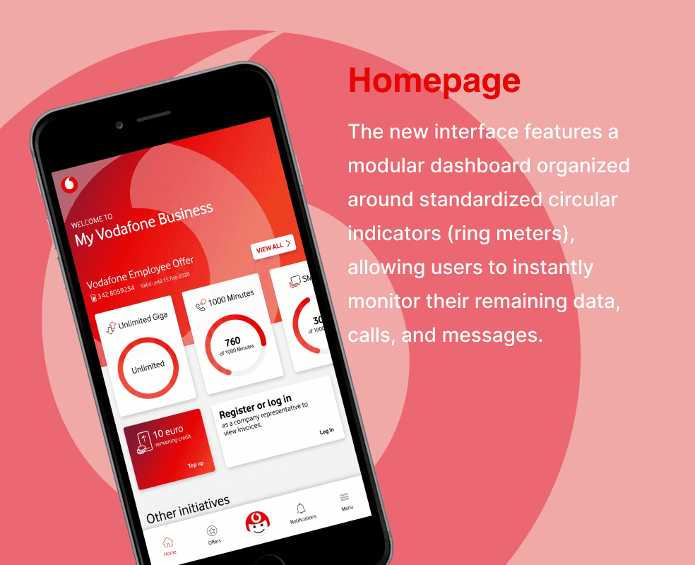
The previous My Vodafone Business app had an unclear interface, with dark colours and a poorly defined visual hierarchy. For B2B users and freelancers, monitoring the status of business lines in real time — data usage, remaining minutes and active services — was not intuitive and created visual distractions. The main challenge is to radically rethink the mobile and web experience: to simplify the information architecture, reduce the cognitive load and align the product with the brand’s visual standards, whilst ensuring quick and efficient access to data.
Analysis and UX Audit: Identification of critical issues in the legacy interface (excessive contrast, poorly legible indicators and fragmentation of usage information). Restructuring of the Information Architecture: Reorganisation of the home screen around the business user’s actual priorities: usage status in the foreground, quick access to tariff plan details and operational notifications. UI Design & Design System: Transition from a dark layout to a light interface, centred on white and Vodafone’s colour palette. Design of standardised circular progress indicators (donut/ring meters) to instantly display data, calls and SMS usage. Creation of a modular card system to manage active plans, add-ons and promotions without cluttering the main view. Navigation & Prototyping: Integration of a bottom navigation bar.

Unified and modular dashboard: A clear interface that allows users to check the status of their business plan in a matter of seconds at a glance. Optimised readability and usability: A visual summary of usage data thanks to scalable components and a typographic hierarchy. Brand consistency: A visual experience aligned with the Vodafone ecosystem.